The web is a fast changing field and the latest trend in the web designing is of responsive designs that you will see everywhere. It is crucial for the designers to learn the technique in order to keep themselves up-to-date. If we define responsive design in simple word, then it simply is a technique to resize the website automatically using HTML and CSSS based on the device the website is accessed from. Responsiveness handles this issue by automatically adjusting and resizing elements for the best possible display.
In this session, we are showcasing 47 tutorials and guides for responsive designs that will greatly help you in learning this technique. Feel free to share your opinions and suggestions with us via comment section below. Enjoy!
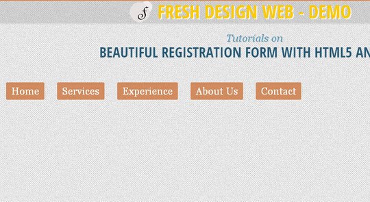
Responsive Retina Ready Menu
In this session, we are showcasing 47 tutorials and guides for responsive designs that will greatly help you in learning this technique. Feel free to share your opinions and suggestions with us via comment section below. Enjoy!
Responsive Retina Ready Menu
A responsive, touch-friendly and Retina-ready menu with three layouts for different browser sizes.

In this tutorial you will learn How to Turn Any Site Into a Responsive Site.

In this tutorial you will learn how to build a “Three Line” Drop-down Menu for a Responsive Website in jQuery.

In this article, we are going to walk you through on how to build a simple navigation from the ground and using the CSS3 media queries and a little jQuery to display it in a small screen size like the smartphones properly.

There’s a growing trend in the industry though to flip this workflow on its head and actually begin with mobile considerations and then work up to a larger desktop version. Why would you ever approach a project this way? What are some of the pros and cons of this strategy? Read on to find out!

Do you still develop websites for the standard screen resolution (1024×768)? Stop doing it! It makes you look dumb in the constantly developing world of the Web.

In this tutorial, we’ll create a responsive menu with new feature of css3 (media queries) to alter the design and layout of a website navigation menu to fit different screen sizes. We have design to change the layout from large screens to smaller screens support, making it responsive display.
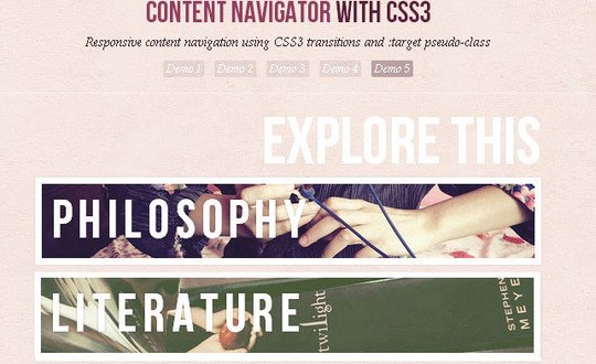
Today we want to show you how to create a responsive, css-only content navigator.
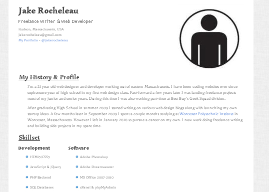
In this tutorial I want to demonstrate how we can build a responsive single-page resume layout. I’ll be coding everything in HTML5/CSS3 to work properly at various screen resolutions. The resume will also support microdata powered by schema.org for more technical SEO advantages.
Here I’m going to share 5 of my commonly used CSS tricks along with sample cases for coding responsive designs. They are simple CSS properties such as min-width, max-width, overflow, and relative value — but these properties play an important part in responsive design.

Typically, to create a column layout, you would need to add the first or last classes to reset the margin space and clear the float. Today I’m going to share a very simple CSS trick to create a responsive column layout using nth-of-type pseudo class.

The techniques in this article explain how we can leverage this powerful capability of CSS to also change imagery, alter the navigation on hand-held devices, and set up default CSS for compatibility older browsers.

To help reprogram your brain to consider layouts in new ways, we’re going to take a look at some interesting responsive design patterns that are being implemented by talented designers all over the web.

This tutorial will show you how to create a cross-browser responsive design with HTML5 & CSS3 media queries.

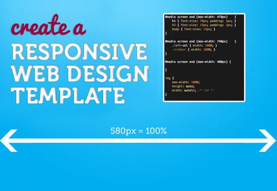
In this tutorial, I’m going to make a (very simple looking) web template that is responsive from desktop size down to mobile version.
Here are some of the lessons we’ve learned working on a recent real-life, large-scale RWD project. Specifically, this post focuses on how we chose to deal with deep navigation in the landscape of a templated environment.
In the penultimate part of our responsive web design tutorial, Clearleft’s Paul Robert Lloyd explains how media queries work, and describes a device-agnostic approach to breakpoints.

Here we’re going to show you how to use a boilerplate called Skeleton to take the headaches out of designing and building a responsive web page. You’ll be stunned at how easy it is!

Make several fixed-width images change their spacing to stay lined up with accompanying text, no matter the window size or text size.

In this tutorial we’ll create a horizontal website layout with individually scrollable content panels. We’ll change the layout for smaller screens, making it responsive.

In this tutorial we will create a slideshow with a parallax effect using several CSS3 properties. The idea is to move the background positions of two backgrounds while sliding the container of the slides.

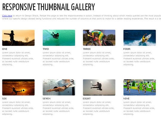
In this tutorial you will learn how to to Build a Responsive Thumbnail Gallery.
Responsive design is all about adjusting designs to accomodate screens of different sizes. So what happens when a screen is narrower than the minimum width of a data table? You can zoom out and see the whole table, but the text size will be too small to read. Or you can zoom in to the point of readability, but browsing the table will require both vertical and (sad face) horizontal scrolling.


